Rewriting an intervention
Because it's the intervention I'd looked into the most, as well as one of the most common, I first started looking at how to rewrite the intervention that customers see when they try to buy an age restricted product.
As a reminder, this is what the current Sainsbury's intervention for this experience says.
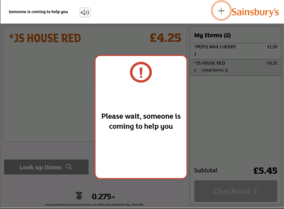
Just focussing on the copy, my main issues with this intervention were:
- The copy doesn't explain to the user why they've been stopped in their journey
- 'Someone is coming to help you' - the 'help you' is quite vague, because for most customers, they don't need help at this point, they just want their items approved so they can pay
- The 'Please wait', as mentioned earlier, comes across as a bit formal
- There's no supporting copy with this headline, so if a customer wants to find out more about what's happening, that just isn't possible
- Using 'someone is coming to help you' makes me wonder who the 'someone' is?
With those issues in mind, I started drafting some possible headlines where the principles of the headlines could be applied to every intervention going forward.
I saw the headline as the most important piece of copy on the intervention. It's the piece of writing the customer is most likely to read, and it needs to set the tone of the dialogue and also tell the customer what's happening next.
I felt that the most important thing to get across to the customer in this moment was that someone was coming to help them.
So the first pieces of copy I looked at sounded like this.
.png)
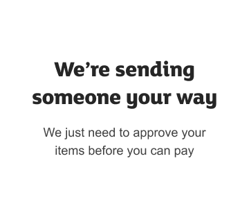
At this stage, I felt like 'We're sending someone your way' was the best solution out of these three. It felt the most conversational and friendly. And I really liked the use of we're and your as a way of personally connecting with the customer.
The issues I had with it still though were the use of the vague 'someone'. Plus the fact the copy was quite long without saying an awful lot. The customer still doesn't know why we're sending someone their way.
Which is why from this point onwards, along with a designer on the self-checkout project, we started looking at these intervention messages as not just headlines, but copy underneath, like below.
The addition of the sub-copy meant that I could focus on keeping the headline as friendly and focussed on one topic, while the sub-copy did the job of explaining more detail to the user.
I still felt like the headline copy here was too long and could be friendlier, and as I wasn't a fan of the 'someone' but really liked the 'we're' - I ended up with this.
.png)
I was happy now that the header was concise, friendly and because the whole intervention is full of 'we', 'our', 'your' and 'you' - I feel it comes across as a much more personal message than 'Someone is coming'.
So with the copy in a good place in my mind, the final step for this intervention was to decide on the icon that accompanied it. In the old intervention style, the intervention would have ended up looking something like this.
.png)
The red and the use of the X icon just gives a negative impression to the customer that they've done something wrong to see this message. It has the effect of blaming the user, which we definitely want to avoid.
At the time of working through this, I'd been working with a designer in the guidelines team on a project around a group of semantic colours to a guidance page. Semantic colours are a group of colours that help communicate key messages like errors (red), warnings (yellow), successes (green) and understanding next steps (blue).
The idea behind semantic colours is that they keep cognitive load low and makes for a unified and engaging user experience across our brands.
.png)
With this in mind, I suggested to our self-checkouts designer for us to use the semantic colours as a way of framing each intervention.
In the instance of this age restriction, it definitely didn't feel like an error, or a warning. And it wasn't a success message. But we were giving the customer information, and we were helping them understand the next steps.
So through a process of elimination, we went with the informational blue for this intervention message.
.png)
With this intervention defined from a copy and design point of view, the next step was looking at ways we could apply this thinking to multiple types of intervention messages at once.
.png)
.png)

%201.png)
%201.png)


.png)
.png)