Translating four brand guidelines into digital-specific UX guidelines.
Background
Working in the UX team for Sainsbury's means you can be designing experiences for any one of four very different brands (Sainsbury's, Argos Nectar, Habitat).
One problem I began to notice at Sainsbury's was that our designers were struggling to truly understand the brand voices they were designing for.
This result of this was experiences littered with messages lacking brand personality or feel, like the example below.
The hypothesis for why designers were struggling to understand how the brands should sound came down to a few reasons:
Each of the five brands had different brand guidelines, with hugely different approaches and structures
The brand guidelines for each brand didn't have a digital focus and a lot of guidance wasn't actually suitable for digital experiences
The brand guidelines were hosted on PDFs and stored locally, so they were hard to reach for colleagues
Brief
In order to help our designers get more familiar with the brand voices and identify the differences between each personality, we proposed:
Translating the existing brand guidelines into digital-specific guidelines
Creating UX-specific examples to help illustrate the brand guidelines
Making the new digital guidelines have a set structure so they're easy to engage with
Only using guidance that's relevant for digital interactions
Hosting the new guidelines on the Luna Design System where designers can easily access them
We proposed this work to the brand team and they agreed with the need to align our brand guidelines into a set digital structure.
Translating the brand voices
To translate the marketing brand guidelines into guidance that was fit for digital experiences, the first task was to remove the guidance that wasn't relevant to UX.
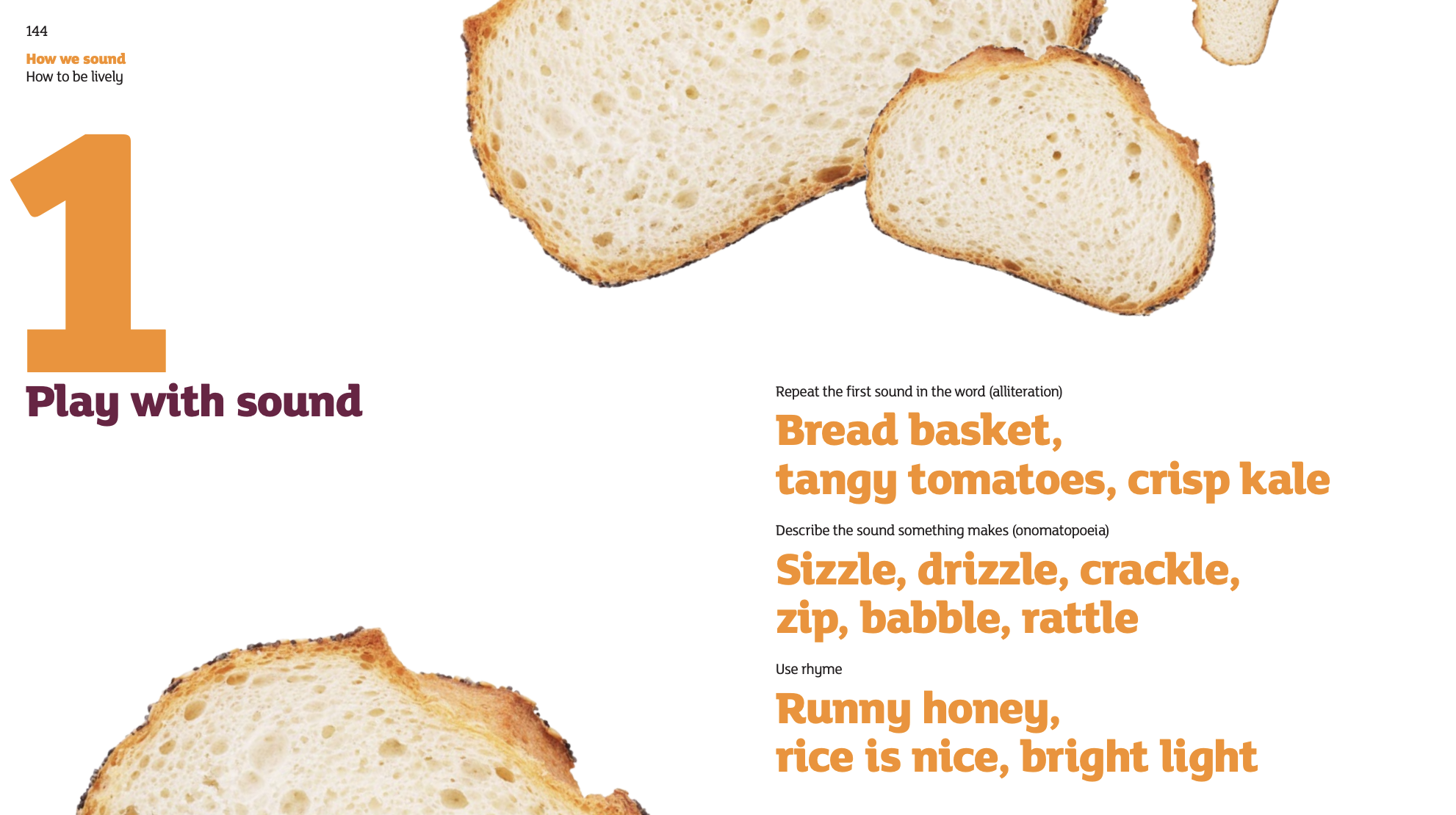
That meant removing things like the below, in the Sainsbury's brand guidelines, which wants users to 'play with sound' to show the Sainsbury's personality.
While alliteration, rhyme and playful language makes sense for marketing guidelines, using those language conventions in UX can confuse users and affect their understanding of an experience.
So to make this guidance into UX-specific guidance, the advice was translated into something much more relevant for experiences.
Through the examples we was able to show our users how much they were able to be playful without going too far.
To further emphasise this point, we also created some guidance around not turning people off with too much lively phrases.
Comparing brand voices
Because designers in the UX team can be designing experiences for any one of four different brands, we wanted to help our designers understand how the brands sound.
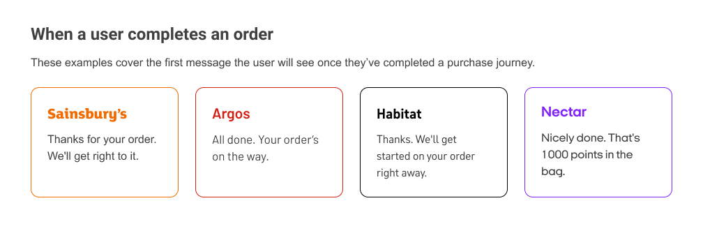
Based on each brand’s voice guidelines, we looked at some different interactions that occur on a digital journey, with examples of how each brand might address them.
The examples were meant to help designers get each brand’s voice ‘in your ear’.
Here are some of the interactions we looked at for brand comparison:
When a user completes an order
When a user goes to log in
When a user is looking for help
When a user searches for something that the website cannot find
When you want to verify a user's email address
Solution
In translating the four marketing brand guidelines of Sainsbury's, Argos, Nectar and Habitat, we were able to send our users to the Luna Design System to further understand the brand's they were designing for.
You can read the digital-specific guidelines for each brand below:
.png)