Brief
The Handshake app was in a very early stage of development, which gave me the opportunity to review and write a full UX journey for the entire experience.
Before I could start writing the user interface (UI) copy for the experience, I had to:
- Research and understand the target audience
- Create a product voice for the app to inform copy choices
- Map the tone of voice across multiple touch points
Once I'd done this work, I could focus on editing the UI copy with a particular focus on clarity, concision and personality.
Research
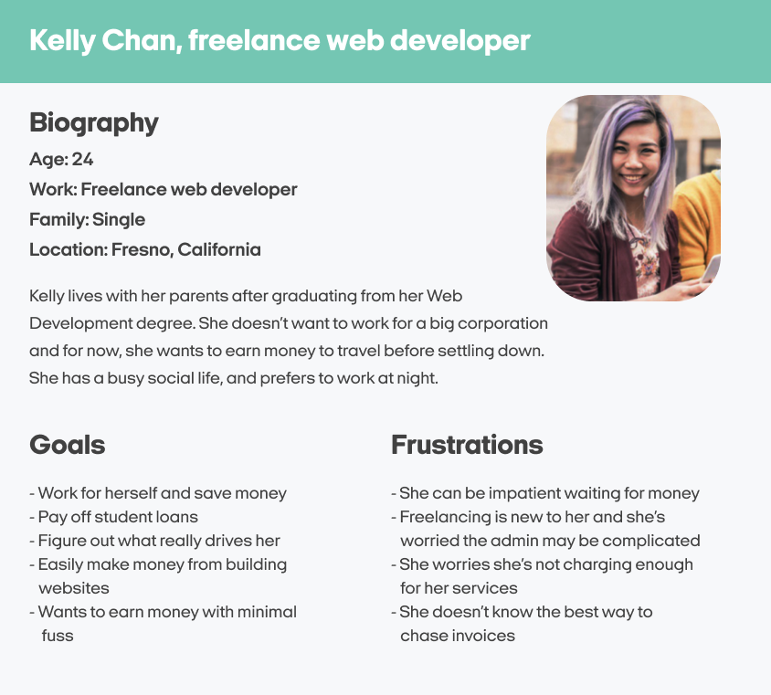
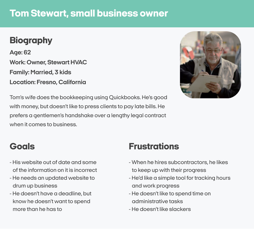
At the beginning of the project, the UX researcher provided me with two user personas that reflected the typical audience of the Handshake app.
These user personas acted as the basis for my understanding of Handshake's audience, as I learned about their personality, needs, expectations, and struggles.
But to define a product voice for the app, I needed to learn the terminology that freelancers and business owners would use to talk about getting paid and making payments.
By speaking in the terminology and language conventions of our users, the Handshake app would be a clearer and more trusted experience for our audience.
Voice research
A big part of my voice research for the Handshake app was looking into the most common terminology for three subjects that I felt encapsulated the foundations of the experience. The subjects were:
- Independent workers
- Collaborative work
- Payments and invoicing
The way I researched the best terms to use for these subjects was a mixture of competitor analysis, social media, freelancer forums, and even looking at complementary financial products such as Monzo and Revolut.
With the learnings from my research, I put together a group of terms for each subject that gave me options to use throughout the app experience.
Independent workers
- Freelancer
Subcontractor
Self-employed
Temporary worker
Consultant
Collaborative work
- Proposal
Deadline
Estimates
Deliverables
Budgets
Payments and invoicing
- Invoicing
Cash flow
Budget tracking
Work expenses
Billing cycle
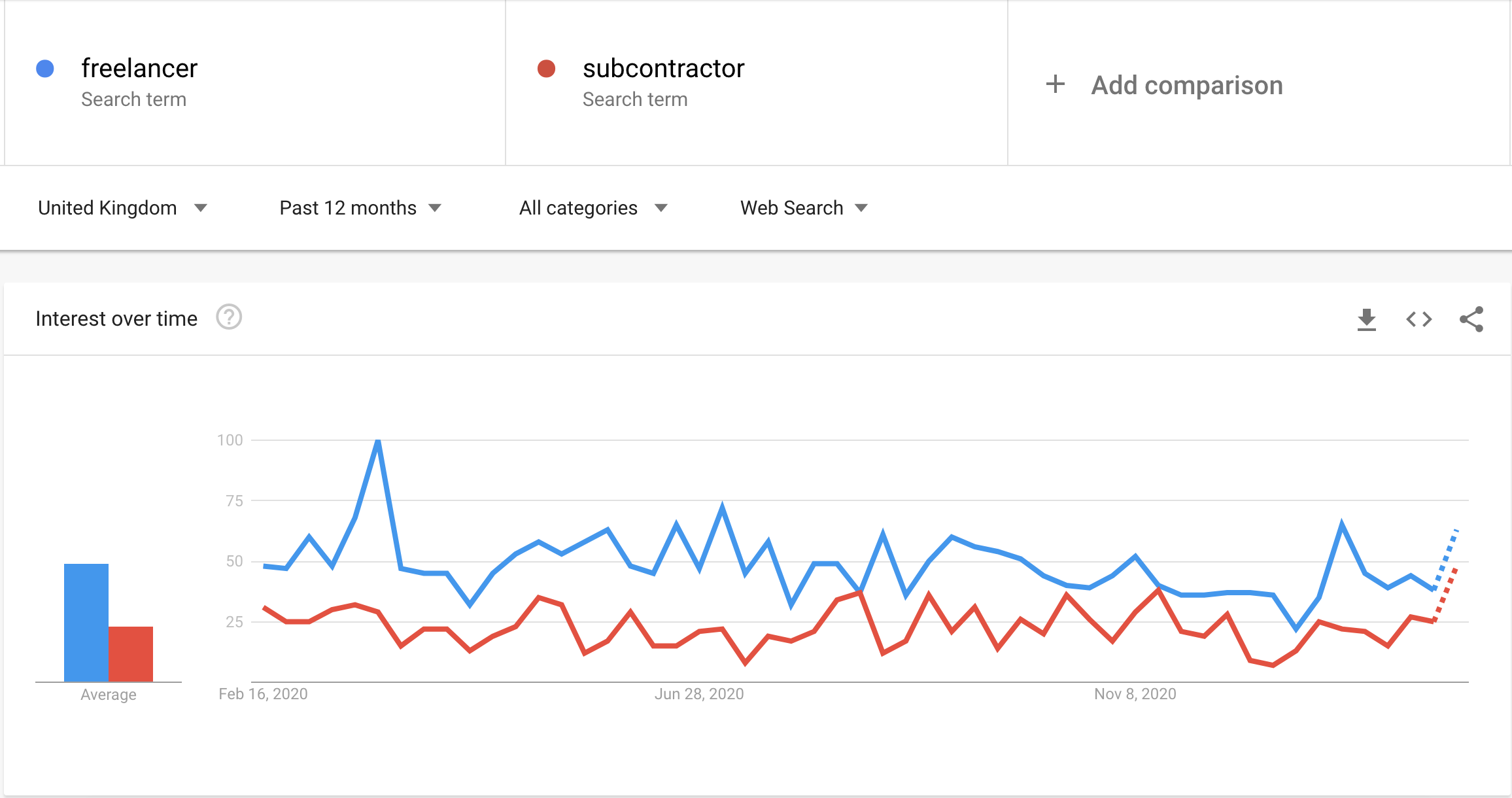
Now that I had some terminology options to choose from, I could drill down further by using Google Trends to compare which terminology is most commonly used.
For instance, I wanted to identify whether "freelancer" or "subcontractor" is more prevalent in the United Kingdom.
As you can see, "freelancer" is a more common term for web searches, so this is the term I lead with in the product.
I continued with this kind of terminology-based research until I felt I had enough information to start plotting out a distinct product voice for the app.
Product voice
The initial research was vital in getting a sense of how Handshake should sound. I started by writing an overarching statement of how I'd like Handshake's words to make our users feel.
Handshake should make our users smile and feel at ease. We're a friendly face ready to point users in the right direction - whether that's helping them with their invoices, or getting a project over the line in a hurry.
With this brand statement as a foundation, I extracted three voice attributes that I felt defined how Handshake should always sound:
Down to earth
We're friendly and informal, using the most widely understood terms. We're part of the same community as our users, so we talk like they do. That means we don't use any corporate jargon or robotic language when we're talking to our users.
Reliable
We look out for our users by solving potential problems in advance, and making sure they always have all the information they need. We're here to help people reach their goals in a transparent and supportive way, so we guide them all the way.
Colourful
We want to sound playful, bright and full of life. We want our words to be a joy to read. We're never cynical, but sometimes we'll throw in some home truths about money and the everyday.
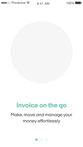
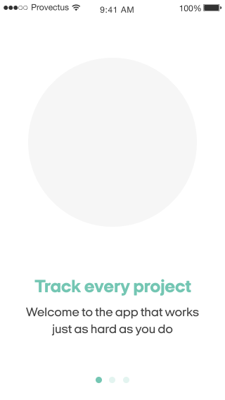
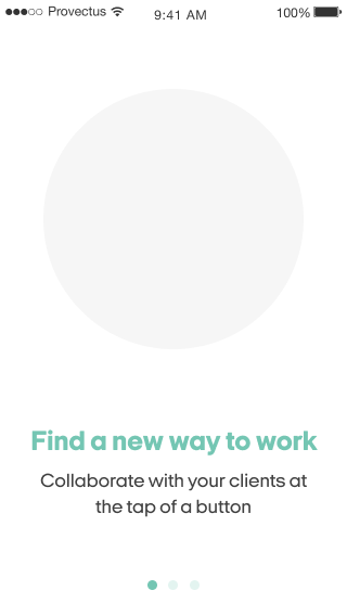
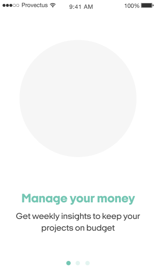
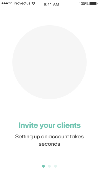
Using the elements of voice I had created, the designer asked me to draft some possible onboarding copy. As the copy is for mobile screens, it needed to be concise, useful and with clear benefits. Here's some of the options I provided:
User interface
The designer of the project provided me with simplistic mockups of the experience, which I used to add copy based on the product voice I'd already created.
Getting started
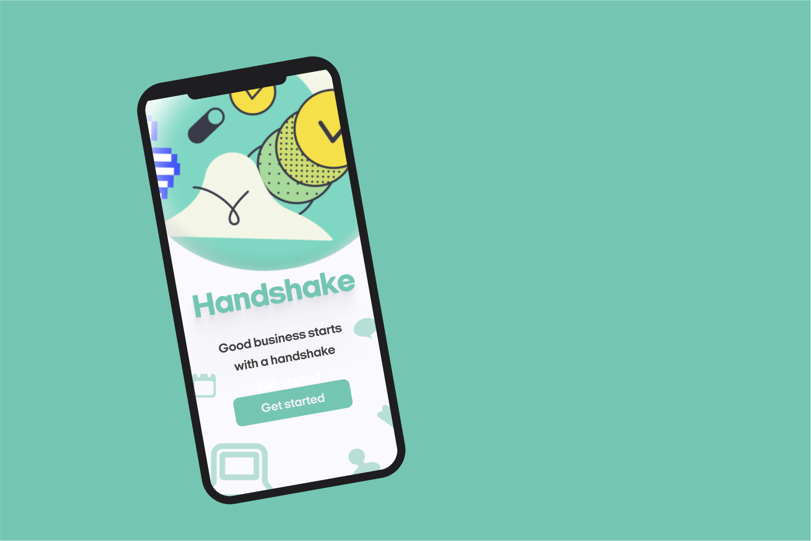
Originally, the first screen of the Handshake app had just one call-to-action on the page, a simple 'Get started' message. When a user tapped on this button, they were taken to a screen where the user had two options:
- To sign in to their account
- To create an account with Handshake
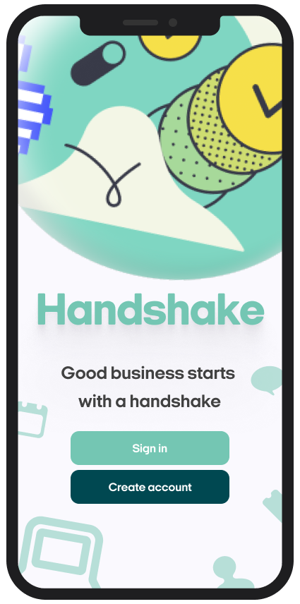
The first change I recommended was to remove this dual-purpose screen, as it felt clunky in design but also confusing to the user. My recommendation was to put the 'Sign in' and 'Create account' buttons right there on the home screen, to avoid an overload of information on the next screen.
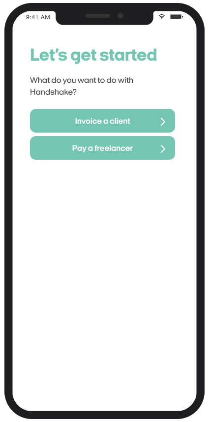
From there, when a new user started to create their account, the next screen they'd see is the 'Let's get started' screen you can see above. When a user is creating an account on Handshake, it's important we know what kind of user they are.
Originally, the copy of this screen tried to get the user to define who they were through call-to-actions that said 'I'm a freelancer' or 'I'm a business owner'.
I felt this kind of copy was too limiting for our users. If a user tried to create an account and didn't feel they fit into either of those buckets, well, what then?
To remedy this problem, I made the call-to-actions firmly action-based, asking the user 'What would you want to do with Handshake?' to help understand their needs. The users still fall into two camps in this screen, but they're much broader than the original messaging.
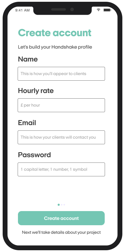
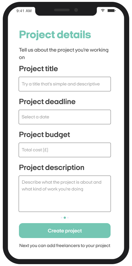
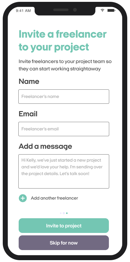
Creating an account (freelancers)
The next part of the journey I focussed on was the account creation stage. If a user tapped that they wanted to 'Invoice a client', we knew they were a freelance user so they started the freelancer account creation journey.
My main focus for these form fields, and in fact most form fields I work on, was simplicity. The message should be clear, concise and easy to scan for the user.
It can be easy to use form field headings that add a bit of personality to the sign-up process. Things like 'We just need to start with your name...' are quite common these days in form field headings.
But while turns of phrase like that do put across a product personality to the user, they also increase the cognitive load of an experience. The user has to read more words and take in more information, so suddenly your simple sign-up process has become a longer, arduous task for the user.
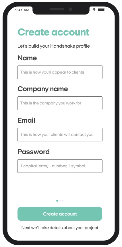
Creating an account (business owners)
Unsurprisingly, I also kept the language as simple as possible for when business owners created an account with Handshake.
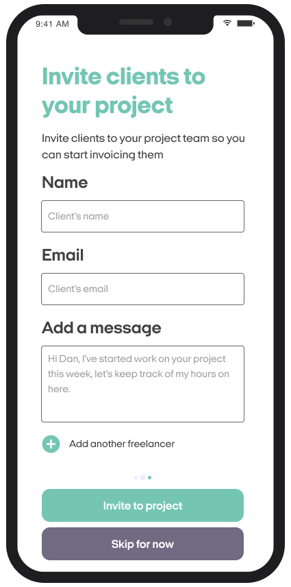
A few things to call out here are the few instances of microcopy I've used across the journey.
Under each of the call-to-actions for these screens, I've added some microcopy that gives the user an introduction to the next screen's content.
By telling the user 'Next we'll take details about your project', we're helping the user to understand what stage they're at in the sign-up process as well as what's going to be coming up next, so there's no nasty surprises for the user.
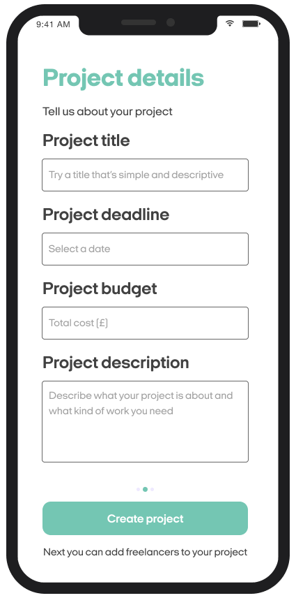
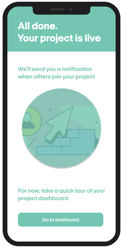
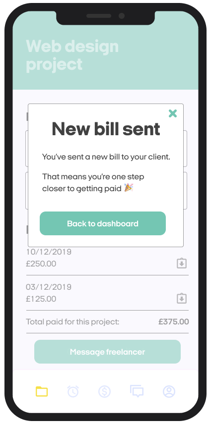
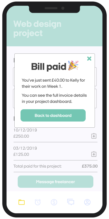
When it comes to the success screen, when a user has successfully created a project, I've decided the copy shouldn't be too congratulatory.
This is because the idea of the app is for users to have many projects on the go at once, so if we put a hugely celebratory message on this screen, there's a chance the user is going to see it again and again, and the screen will become boring.
My idea is that for the user, the time when we and they should be celebrating is not when a project is created, but when a project is finished (business owner) or they've been paid by the client for their work (freelancer).
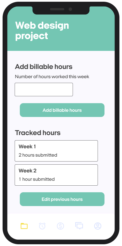
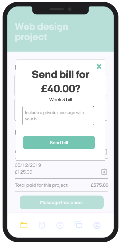
Invoicing a client
When it came to the ongoing use of the app, and how users perform the daily tasks, my main focus was to anticipate friction points and make sure users have enough information to complete each task.
To help users feel confident inputting data, I added simple microcopy and hint text. The idea was to keep these screens light on copy, so each piece of copy had to earn its place in the experience and be useful for the user.
Throughout these screens, it was important to promote the user's trust in Handshake by ensuring the formatting, syntax, spelling and punctuation were consistent through the journey.
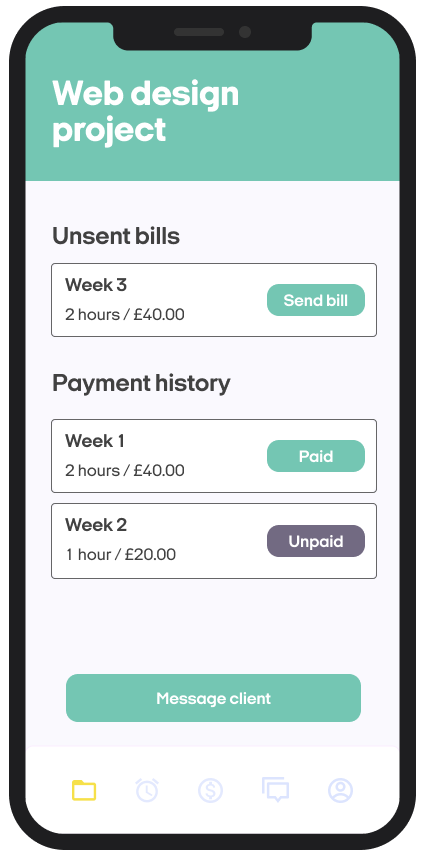
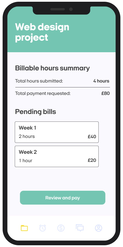
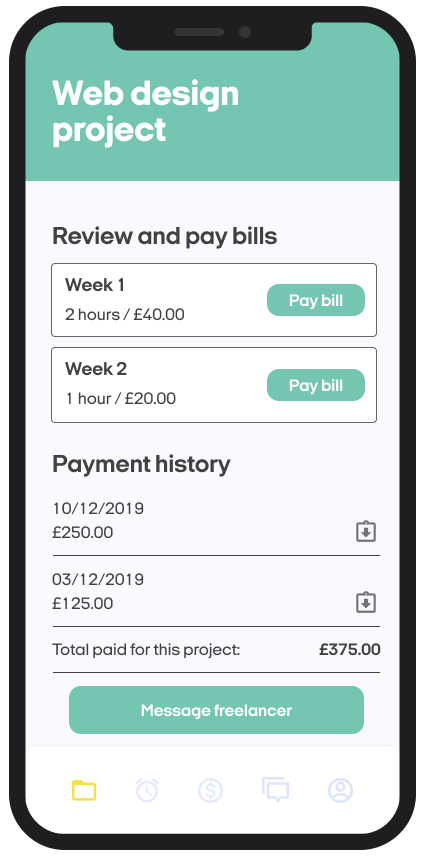
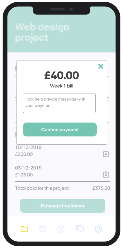
Paying a freelancer
I followed the same logic around simplicity and clarity in the business owner's section of tasks as I did the freelancers. The main difference here was the framing around paying a bill to the freelancer.
Inspired by my earlier research, I found that the way Monzo handled sending money to people to be very effective. The way they clearly showed the money about to sent at the top, with minimal messaging around the confirmation, feels very clear and easy to understand for the user.
Within the payment screen, I also included a space for business owners to include a message with their payment as a way to build on the idea of Handshake being an app that creates better end-to-end relationships between freelancers and business owners.