Creating a seamless, measurable, and inclusive application journey for Vogue's Open Casting program.
Background
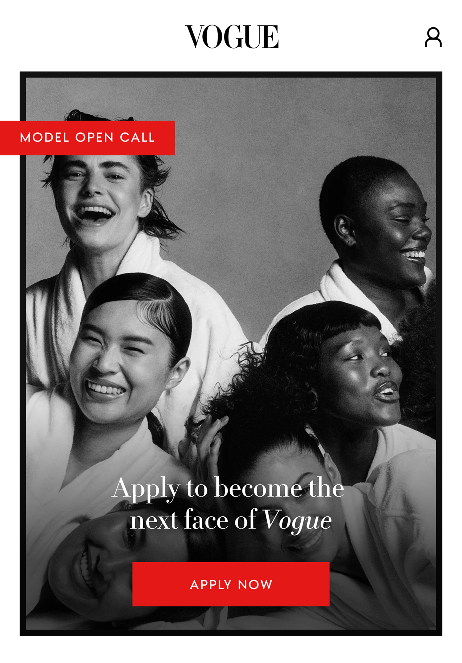
Vogue’s Open Casting is a global initiative aimed at discovering a new generation of models who embody contemporary ideals of beauty and individuality, with the intention to widen the roster of models both at Vogue and the fashion industry at large.
In previous years, submissions for Open Casting were driven via a typeform where applicants added their personal information, and then applicants posting on social media their catwalks and portfolio images.
With over 60,000 applicants each year, this approach was extremely hard to track for casting directors and offered limited opportunity for meaningful engagement, as none of the application process was owned or managed by Vogue —so despite the high number of applicants, they didn't feel the benefit of that much engagement with the brand.
For applicants to Open Casting, the submission process wasn't cohesive as it spanned multiple platforms and there was no way of keeping tabs on their application with very little opportunity for communication.
Brief
For the 2025 edition of Open Casting, the brief was to integrate the entire application experience directly into the Vogue app, creating a seamless, measurable, and brand-cohesive journey for applicants.
Goal: Build a dedicated in-app application flow that would: - Increase the number of applications - Increase the number of app users - Improve the selection process for casting directors with a seamless backend experience - Elevate the experience to match Vogue’s premium brand values.
My role on this project was as the lead content designer, focusing on how we can make the application journey easy, inclusive and clear to all applicants. To do this, I collaborated with product designers, engineers, researchers, product managers, marketing teams, and Vogue's editorial team.
Research
To start the project discovery, I partnered closely with a user researcher to ground the project in real applicant needs.
Together, we interviewed both current and prospective models to understand their past experiences with casting applications — particularly those submitted via social media and external forms.
These conversations revealed where previous processes fell short: uncertainty about whether applications had been seen, a lack of feedback or clarity on next steps. Some of the overarching themes that came out of these interviews were:
Beginner support & accessible resources Newer models need structured guidance and accessible resources to navigate the application process. Providing visual examples, simplified language, and beginner-focused tools can make the platform more approachable.
Transparency & communication Clear communication at every stage of the process from submission confirmation, application status updates, and constructive rejection feedback was cited as essential to building trust and reducing applicant anxiety.
Inclusivity & diversity Participants want the platform to be more explicitly inclusive i.e. by having expanded application options that reflect all body types, ethnicities, and personal attributes and visuals to reflect this as well.
Community & growth There is a lack of resources and community in the model world and models would value a sense of community, mentorship, and networking. They want access to peer collaboration, educational resources, and opportunities for skill-building to help them succeed in the industry.
With these overarching themes in place, I could start working on the structure of the application journey with these things in mind.
The challenge of the application experience
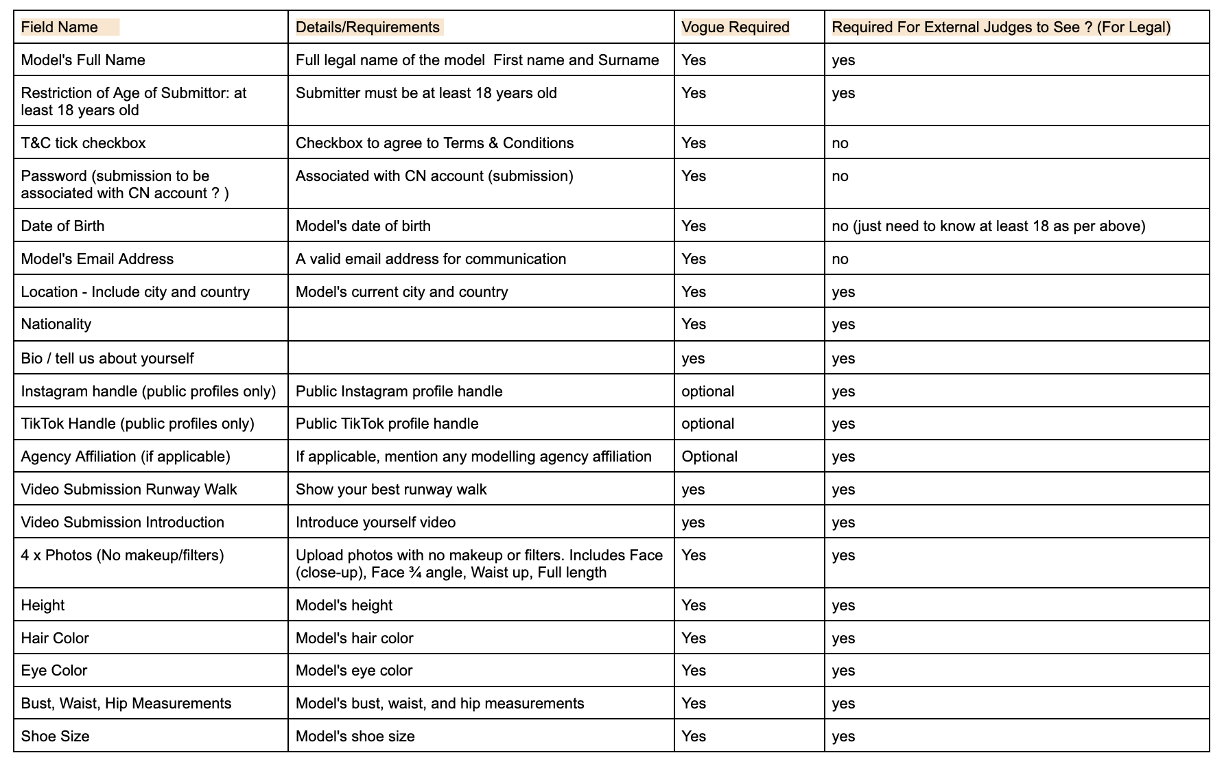
To start designing the application journey, the first thing I needed to understand was what information each applicant needed to complete in order to be considered.
I worked closely with our Vogue editorial team, specifically the casting directors, to fully understand the information they would need from each applicant to be able to accurately judge their modelling potential.
The challenge
Editorial provided the above comprehensive list of information required for a valid Open Casting submission. While necessary from a selection and compliance perspective, the list was long and potentially overwhelming if presented to users in a single, linear form.
Previously, when applications lived in survey forms or social posts: - Users often dropped off partway through - It wasn’t always clear what was required upfront - Applicants felt pressure to complete everything in one sitting - Progress was difficult to track, both for users and internally
Moving the application into the app gave us the opportunity to rethink the experience — but it also raised a key question: How do we help users feel in control of a long application without overwhelming them?
My role was to translate these requirements into an application experience that felt manageable, intuitive, and respectful of applicants’ time, without compromising on what the editorial team needed to make decisions.
The initial approach: a linear application
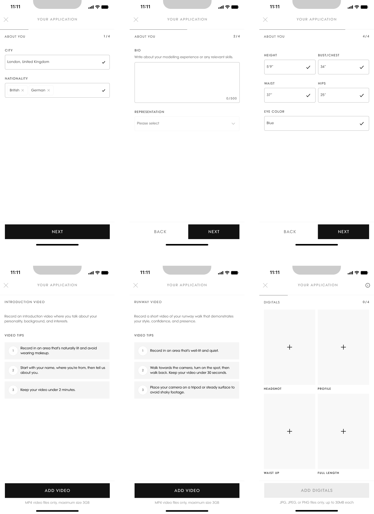
Our first iteration followed a familiar pattern where users entered the application and moved through approximately 10 screens, one step at a time.
Each screen grouped tasks together so they felt easier to complete: - Location information - Biography - Attributes - Introduction video - Runway walk video - Photo uploads
From a product perspective, this felt straightforward. From a user perspective, testing told a very different story. What we learned in testing
When we tested the above screens during user interviews, several recurring issues emerged:
1. Users felt lost in the process
Because the flow was strictly linear: - Users didn’t know how many steps remained - They couldn’t easily return to previous sections - The overall scope of the application was unclear - Participants frequently asked questions like: “How much more is there?" or “Have I already done the videos?”
2. Video steps caused anxiety and drop-off
Video uploads were a major friction point: - Users often needed to leave the app to film their videos - They weren’t confident their progress would be saved - Some assumed leaving meant starting over - Several testers hesitated to proceed, unsure whether they were “ready enough” to continue.
3. The experience encouraged all-or-nothing behaviour
The linear flow communicated to users that: You should complete this in one go. For a casting application — which requires preparation, confidence, and privacy — this expectation felt unrealistic and intimidating.
While the issues surfaced through usability testing, they were fundamentally content and structure problems.
- The experience didn’t communicate progress - It didn’t set expectations clearly - It didn’t reassure users that their work was safe - It didn’t give users permission to pause
This made it clear that we needed to rethink how the application was framed, not just how it was styled.
Introducing the application hub
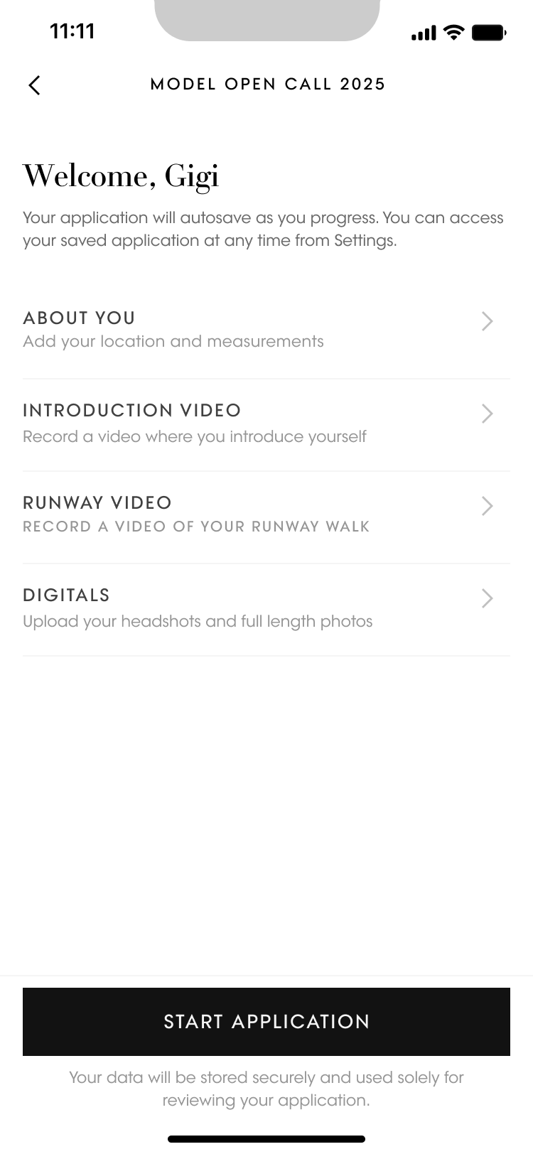
In response, we introduced a table of contents–style entry screen that users see when they start their application.
This screen acts as: - A map of the application - A progress tracker - A reassurance mechanism
Instead of being pushed immediately into the first question, users now land on a clear overview of what’s required.
We grouped the application into four distinct sections: About you Add your location and measurements
Introduction video Record a video where you introduce yourself
Runway video Record a video of your runway walk
Digitals Upload your headshots and full-length photos
Each section represents a different level of effort, allowing users to: - Understand the commitment upfront - Choose the order that suits them - Prepare content (especially videos) in advance
This shift reframed the application from a “form” into a set of manageable tasks.
Designing for pause-and-return behaviour
Based directly on testing insights, we explicitly designed for interruption. Clear messaging at the top of the screen tells users: - Their progress saves automatically - They can leave and come back at any time
This was critical for rebuilding trust after users expressed fear of losing work.
Completion indicators
Once a section is finished, it’s marked with a tick: - Reducing memory load - Preventing accidental repetition - Creating a sense of progress and accomplishment
This small visual signal significantly improved confidence during testing.
Language choices that reduce pressure
We were careful not to introduce urgency or performance anxiety. - “Start application” instead of “Apply now” - Supportive, factual descriptions under each section - No countdowns or progress bars that imply speed
The tone reinforces that this is a flexible process — not a timed test.
Outcome in testing
After introducing the application hub: - Users were far less likely to abandon the process after starting - Video-related drop-off decreased - Testers reported feeling more “in control” of the application - Users were more confident leaving and returning later - Most importantly, the experience aligned more closely with Vogue’s inclusive message: inviting people in, rather than challenging them to prove readiness immediately.
Results
Launching Open Casting inside the Vogue app led to a significant increase in both participation and engagement. The 2025 casting received 100,000 applications, an uplift of 40,000 more submissions compared to the previous version, which relied on social media hashtags and external forms.
Centralising the experience in the app removed friction from the process and made it easier for users to start — and finish — their applications.
The in-app experience also drove meaningful growth for the product. Open Casting contributed to 70,000 additional app downloads during the campaign period, with a large proportion of applicants either downloading the app specifically to apply or returning to it multiple times to complete their submission. Average session length among applicants increased by 35%, reflecting the time spent engaging with different sections of the application.
Just as importantly, the redesigned structure improved how users felt while applying. With autosave, section-based progress, and the application hub, applicants were far more confident leaving and returning to the flow. Internal metrics showed that over 60% of applicants completed the application across multiple sessions, validating the decision to support pause-and-return behaviour rather than a single, linear journey.
Overall, the project demonstrated that a clearer, more flexible content structure doesn’t just improve usability — it directly impacts participation, engagement, and brand trust. By making a high-effort application feel manageable and forgiving, we invited more people to take part and stay connected with Vogue beyond the casting itself.