Bonus points exploration
After deciding on bonus points as our initial direction for integrating Nectar into Sainsbury's online channels, I worked closely with a designer from the guidelines team to define the look and feel of the Nectar bonus points component.
The designer worked on the styling of the component, and I collaborated with Sainsbury's and Nectar stakeholders to define the position and copy of the component.
For our first steps of exploration, we looked into putting the bonus points component inside the Sainsbury's product cards, for maximum visibility, as below.
.png)
A problem with this component solution came early in my discussions with Sainsbury's stakeholders. The middle of the product card is a fairly busy environment, with all sorts of information stored in there. As well as the long product name and the price, a product card could also have weight information, promotional information and dietary information all in the middle of the product card.
This meant that adding the bonus points component in the middle of the product card was a bit of a no-go. It would either be too prominent for the user, and take away from important space from the price and the dietaries. Or it would be too subtle, and completely missed by the user.
Our next exploration looked at taking the bonus points component outside of the middle of the card, and instead putting it on the top, as below.
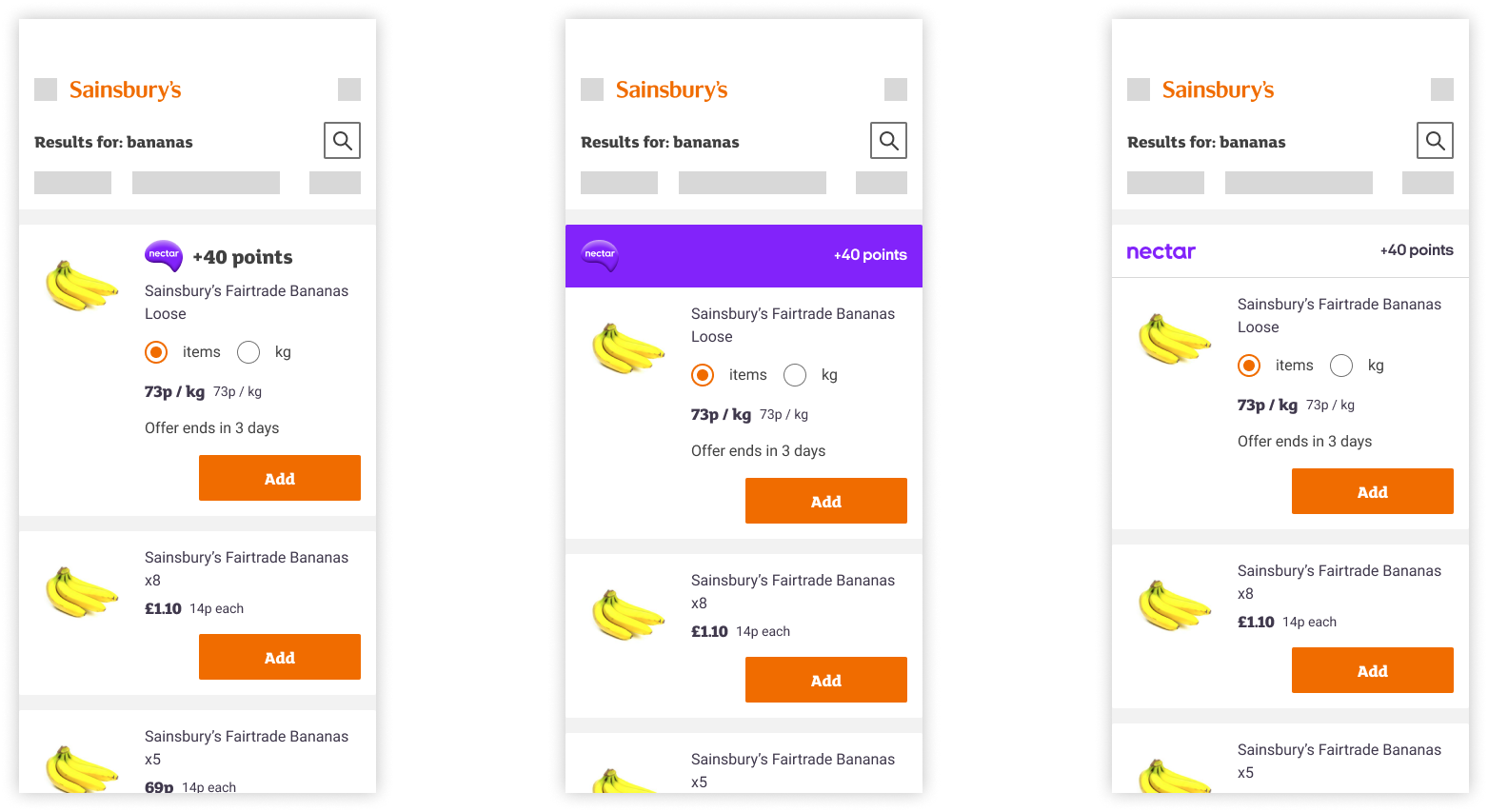
This solution had the advantage of being prominent enough to draw the attention of the user without the information being lost in the centre of the card.
From a Nectar point of view as well, their stakeholders particularly liked this solution because it also aligned with how they deal with bonus points in their app, giving a design consistency across the two brands.
The issue we had with this solution, with the bonus points component at the top of the card, was that if anything it gave too much prominence to the bonus points promotion.
In the above example, +40 points is the equivalent of the user earning an extra 20p to their Nectar balance total if they buy those bananas. So there was definitely a question of whether the 'value' is enough to place the component so prominently.
Another point of consideration with this solution was around accessibility. A user tabbing through this page using keyboard assistive technology would learn that an item had +40 points before they had the context of a) what the item was and b) how much the item was.
With that final point of discussion, we ultimately decided on a solution where the bonus points component should sit at the bottom of the card, underneath the most important information to the user.
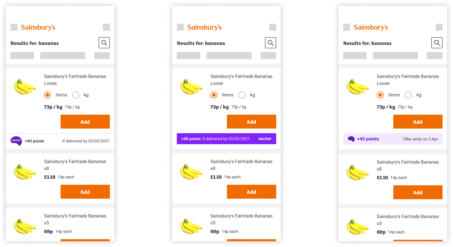
Both the Sainsbury's and Nectar stakeholders agreed with this positioning, once we'd shared our issues with the previous placements.
As a designer and writer duo, we pushed for the final of the above examples, with the light purple tint, to be the component used for bonus points for a few reasons:
- It's much subtler and takes much less attention away from the card compared to the dark purple
- The Nectar logo without the word-mark works better as the word-mark wouldn't be visible, and because of the context of this journey, the Nectar logo is recognisable without the word-mark
- The word 'Nectar' isn't necessary on the component because of the previously-mentioned context (users need a Nectar app to see these offers)